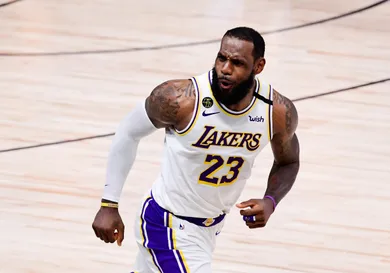
Every year, teams throughout the NBA excite their fans as they come through with official looks at the designs for their beloved City Edition and throwback jerseys. Of course, these jerseys typically get mixed reactions as no one is really able to come to a consensus on how they feel about the designs. This is especially true when it comes to teams like the Los Angeles Lakers, who are a franchise filled with history.
Just last month, fans were treated to a special teaser of the Lakers' upcoming Classic Jerseys, which contained a gorgeous shade of blue. The jersey is modeled after the team's uniform from back in 1960 when the team had moved to Los Angeles from Minneapolis. Fans have been excited about these uniforms and now, thanks to Hoop Central on Twitter, we have a fresh look at the City Edition version.
As you can see from the tweet above, the jersey has a reverse look from the Classic Uniform, except the font on the front goes more with what the team uses right now. Most of the jersey is covered in white, while a nice shade of blue is used as a highlight, all while the numbers on the front are in silver.
You can see the Classic Jersey in the tweet below, so let us know which one of these you actually prefer.
